
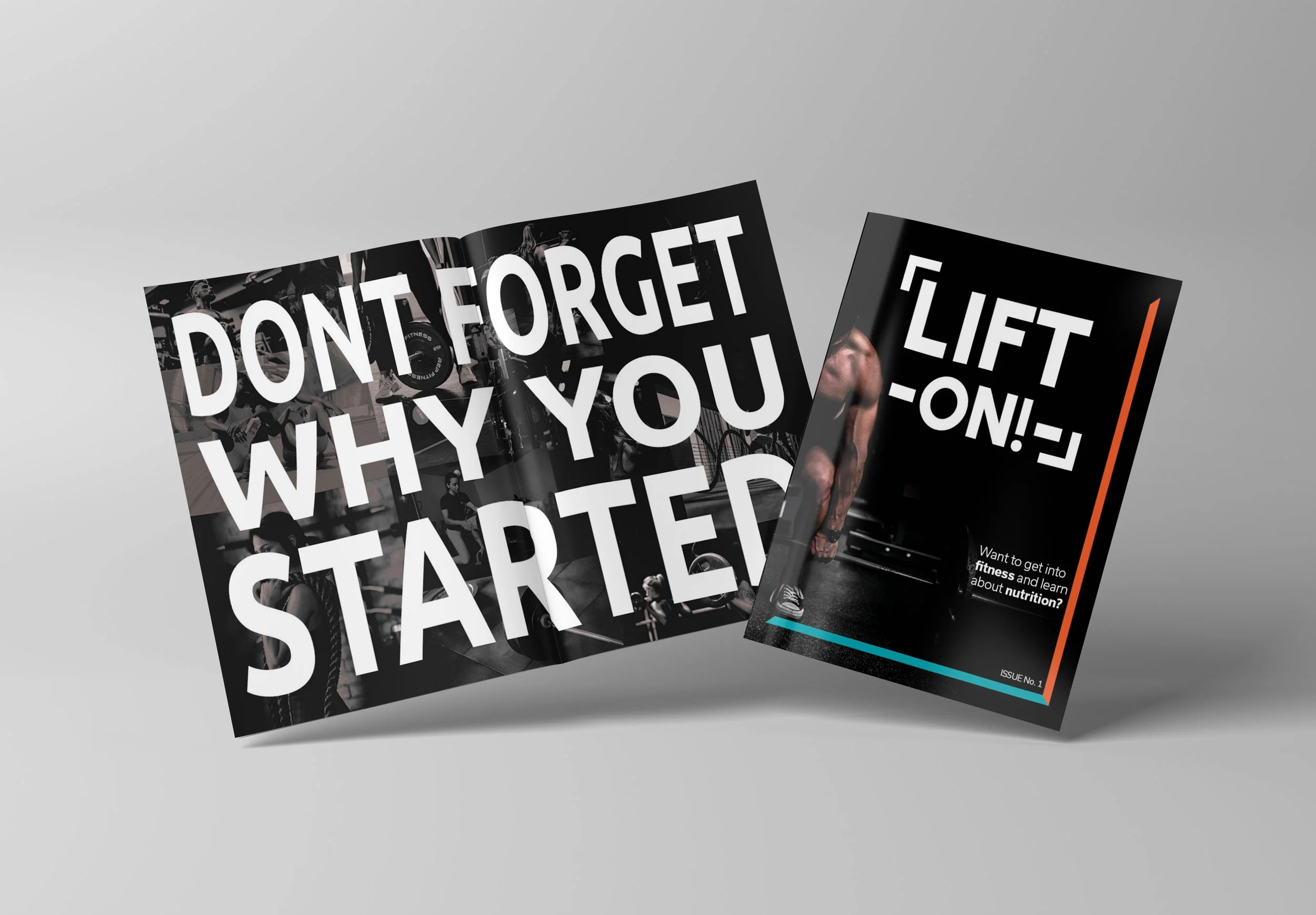
A fictional 32-page fitness magazine. Featuring expert fitness guidance, evidence-based nutrition, and motivational content. Information was sourced through various articles and books sourced through my schools library database.
Lift-On! Magazine
Each page layout prioritizes legibility and hierarchy with a coordinated typographic system, consistent color palette involving orange and blue, and imagery promoting & advocating for an active and healthy lifestyle.
This publishing blends practical how-to articles, adaptable meal plans, and brief motivational pieces designed for readers at every experience level.
Designed with an authoritative yet approachable and informative tone, and carefully optimized for print production (CMYK-ready files with print-safe bleeds, and proper color profiles).
Various spreads involve different information and visuals; for both motivational uses, and for ease of understanding for people who are entering their fitness/health journey for the first time.
The front & back covers create one unified image that acts as a guide of where to look to the eye, causing viewers to be intrigued by the magazine. Paper, varnish, embossing, and die‑cuts add texture, depth, and contrast. The result is a cohesive front & back cover that draws attention, sets the tone, and invites a closer look to anyone, especially to those interested in a healthier lifestyle.